ARCHITECTURAL PILGRIMAGES
There is nothing better than being excited by one's job, when this job comes from the long lasting passion. Like the photography in my case.
I have recently realized, that I am an 'architectural junkie'... Between the projects for the clients, paid projects, I spent most of my time searching for the architectural marvels to shoot on my own, for my own portfolio.
When I find something I am excited about, it's a long lasting 'fix'.
Since the beginning of my career in photography, I was involved in shooting architecture - starting from the badly preserved, ancient architecture during my archaeological contracts, to working for the architectural companies in New York.
However, I embark often on a sort of 'pilgrimages' to the visit the objects created by the best architects of the modern era. This sort of 'pilgrimages' push me to travel (sometimes long distances) to have a chance to photograph examples of a great architecture, like F.L. Wright's "Falling Water", Johnson's "Glass House", or others, like those shown here.
'JENGA TOWER' located at 56 LEONARD STREET - (designed by Herzog & de Meuron)
New York, New York
The building was designed by the Swiss architecture firm Herzog & de Meuron, which describes the building as "houses stacked in the sky." It is the tallest structure in Tribeca. (after Wikipedia)
I invite you to see the extended presentation - link at the right end of the line.
'THE OCULUS' (designed by Santiago Calatrava)
New York, New York
The Oculus has access points across the entire 16-acre World Trade Center campus, including private entries into commercial office towers (One World Trade Center, 3 World Trade Center, and 4 World Trade Center) and connects to Brookfield Place through the West Concourse.
The Oculus and Transportation Hub are owned and operated by the Port Authority of New York and New Jersey.
The Oculus was positioned as part of the World Trade Center masterplan by Daniel Libeskind and designed by Santiago Calatrava. The structures white metal-clad steel ribs reach up and out in a monumental move symbolic of a hand releasing a dove. (after officialworldtradecenter.com)
I invite you to see the extended presentation - link at the right end of the line.
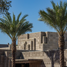
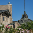
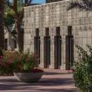
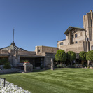
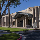
'ARIZONA BILTMORE HOTEL' (part of Waldorf Astoria Hotels and Resorts - architect of record: Albert Chase McArthur - with cooperation of Frank Lloyd Wright)
Phoenix, Arizona
Frank Lloyd Wright influences have been added to the property over the years. This includes a stained glass window design entitled "Saguaro Forms and Cactus Flowers" that Wright designed as a magazine cover for Liberty Magazine in 1926. It was fabricated by Taliesin students and installed during the 1973 hotel renovations and restoration. Reproductions of the geometric 'sprite' statues originally designed by Wright and sculpted by Alfonso Iannelli for the 1915 Midway Gardens project in Chicago are placed around the property. Also, the original hotel solarium was converted to a restaurant in 1973 and since the mid-1990s has been named 'Wright's'. Three onsite restaurants bear Wright's name: Wright's at the Biltmore, The Wright Bar, and Frank & Albert's.
I invite you to see the extended presentation - link at the right end of the line.
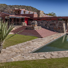
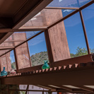
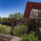
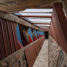
'TALIESIN WEST' (designed by Frank Lloyd Wright)
Phoenix, Arizona
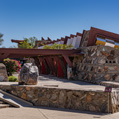
Taliesin West was architect Frank Lloyd Wright's winter home and studio in the desert from 1937 until his death in 1959 at the age of 91. Today it is the headquarters of the Frank Lloyd Wright Foundation.
It is one of the most important 'architectural pilgrimage' places in the United States. In the presence of sucha greatness, I decided not to try to describe it on my own. Let the images speak for themselves...
I invite you to see the extended presentation - link at the right end of the line.
'PORTA NUOVA' Area Development by Cesar Pelli & Associates (primarily), and others
(with cooperation of: NORMA Engineering).
Milan, Italy
Unicredit Headquarters Tower by Pelli Clarke Pelli (2013)
"These three office towers and their podium are the largest components of Porta Nuova Garibaldi, a mixed-use development north of Milans city center. Pelli Clarke Pelli Architects designed the master plan for the 7-hectare development, which creates a new and grand gateway to the city."
Read more at: ARCHITECT Magazine
Unicredit Pavilion (so called ARMADILLO) by Michele De Lucchi Architect (2015).
'The Unicredit Pavilion, created by Italian architect Michele de Lucchi, is a modular structure which aims to promote social functions and experimental activities, hosting cultural events, conferences, exhibitions and concerts.'
Read more at: ARCH20
Solaria Tower (with Aria Tower and Solea Tower) was developed by the Miami Arquitectonica Studio founded by the Peruvian architect Bernardo Fort-Brescia with cooperation of The Dolce Vita Homes studio, together with partners Antonio Citterio, Patricia Viel and Partners, and Caputo Partnership International.(2012).
2019 AIA Florida Design Awards - Merit Award of Excellence
"The project introduces the first high-end residential high-rise living to Milan, with two towers soaring 34 and 17 stories high, respectively."
Read more at: AIA FLORIDA and at: A Guide to C Architecture
Vertical Forest (2 towers) by Stefano Boeri (2014)
Team: Stefano Boeri, Gianandrea Barreca, and Giovanni La Varra.
Vertical Forest is a model for a sustainable residential building, a project for metropolitan reforestation contributing to the regeneration of the environment and urban biodiversity without the implication of expanding the city upon the territory. It is a model of vertical densification of nature within the city ( )."
Read more at: INEXHIBIT: 'The Vertical Forest towers in Milan by Boeri. Phenomenon or archetype?' and at: StefanoBoeriArchitetti.net
White Wave by PIUARCH (2013)
The Studio Piuarch is awarded the prize Italian Architect 2013 and its new building is the symbol of the rising Milan architectural revolution
Design team: Francesco Fresa, Germán Fuenmayor, Gino Garbellini and Monica Tricario.
Read more at: DESIGNBOOM: 'white wave by piuarch flows through milan neighborhood' and at: ARCHELLO: 'A White Wave in Milan'
'LANDESMUSEUM' - Extension to the National Museum - by Christ & Gantenbein Architecten.
Zurich, Switzerland
Christ & Gantenbein has unveiled its new wing for the National Museum Zurich an angular concrete edifice conceived by the Swiss architects as a robust and spacious "museum factory".
Open to the public in 2016, the new wing provides exhibition galleries, an auditorium and a library for the 118-year-old museum, which houses the largest collection of cultural and historical objects in Switzerland.
The raw concrete was chosen by Christ & Gantenbein to stand in stark contrast to the historical stone structure, planned by architect Gustav Gull in the late 19th century.
But the volume is intended to complement the shape and massing of the old building. It adjoins it in two places, enclosing a courtyard in between, and mimics the forms of the original roofscape.
"The old and new buildings are directly coupled to each other so as to form an architectural and urban ensemble," said Christ & Gantenbein, whose other projects include the proposed extension to the Kunstmuseum in Basel.
Read more at Read more at: DE ZEEN
Read more at Read more at: ARCHDAILY
'FONDAZIONE PRADA' by Rem Koolhaas + SYMBIOSIS area redevelopment
Milan, Italy
The Fondazione Prada master plan by OMA REM KOOLHAAS is designed to preserve the buildings as they have come down to us, with the addition of three completely new constructions which improve the areas overall appearance, adding new functions for relaunching the area in the new millennium.
Read more at: FLOORNATURE
Located in a former gin distillery dating from 1910 in the Largo Isarco industrial complex on the southern edge of Milan, the new home of Fondazione Prada is a coexistence of new and regenerated buildings including warehouses, laboratories and brewing silos, as well as new buildings surrounding a large courtyard.
The complex aims to expand the repertoire of spatial typologies in which art can be exhibited. The project consists of seven existing buildings, and three new structures: Podium, a space for temporary exhibitions; Cinema, a multimedia auditorium; and Torre, a nine-story permanent exhibition space for displaying the foundation's collection and activities.
Read more at: OMA OFFICE WORK
Fondazione Prada is located on the North side of the area of the SYMBIOSIS Area Redevelopment Project. Read the PDF Document
To the South, directly facing the Fondazione Prada is the new Headquarters of the FastWeb Company designed by ANTONIO CITTERIO PATRICIA VIEL multidisciplinary firm who is responsible for the SYMBIOSIS Master Plan - the revitalization of this part of the Southern Milan.
Read more at their website: ANTONIO CITTERIO PATRICIA VEIL
Also at 'Archiscene' - Fastweb Headquarters by ACPV Antonio Citterio and Patricia Viel
'MACIACHINI CENTER' - Redevelopment of the post-industrial area of the city - Cooperation of: Maurice Kanah (Kconsult Engineering Srl), Sauerbruch Hutton Architects, Alessandro Scandurra, Italo Rota and Paolo Pasquini (Elementary Studio).
Milan, Italy
The buildings to the South-West of the area constitute the first phase of the Maciachini Center project. The permeability of the spaces that articulate them and the materials of the external covering, glass and corten steel, create at the same time a strong relationship with the context and a new urban reference.
MAC567 - Buildings for offices, by Sauerbruch Hutton Architects (Developer: Doughty Hanson & Co Real Estate)
Redevelopment of a former industrial area in the center of Milan.
MAC9 Zurich Insurance Company Italian Headquarters
The building by Alessandro Scandurra is the product of a contemporary thought that intends to overcome the classical division between different building typologies and that questions itself on the relationship between nature and architecture.
The ground floor is designed as a piece of landscape, flows smoothly through the overlying volume, connects the various dimensions of the existing building, integrating the spaces destined for the archive and the functions in closer contact with the street, in an articulated system of paths that lead to the great central void, a garden with tall trees topped by the inner courtyard. This space is inspired by the intermediate Piranesian places, interior and interior spaces that connect different spaces and times. A giant order of pillars directly supports the first floor that is that of the elevated square, a large terrace that overlooks the garden and concentrates the corporate community functions, a hub of distribution paths to the main and secondary nuclei of the offices.
Read more at: THE PLAN: SCANDURRASTUDIO, MAC 9, ZURICH INSURANCE COMPANY ITALIAN HEADQUARTERS
Puppet Theater and Puppet Museum - by Italo Rota
The soundstage and the museum are the culmination of the green area within the new Maciachini Center block: an integrated project, in which the underground car park, the park above and the new buildings interpenetrate creating opportunities for exchange between interiors and external, whose fundamental example is the large basin that becomes a natural outdoor theater area.
Food Park - by Paolo Pasquini (Elementary Studio)
The concept for the Food Park draws strength from the idea of a building immersed in an urban forest, and constitutes a green diaphragm that runs parallel to the new project road, mitigating the impact of Kconsult and Sauerbruch Hutton office buildings on the central space.
Office Building and Fitness Center - by Italo Rota
Two introverted and very characteristic buildings enclose the central green space of the new block towards Via Imbonati.
'CITY LIFE MILAN' by Zaha Hadid Architects (tower and residences) - with cooperation of Studio Daniel Libeskind (tower and residences) and Arata Isozaki & Associates (tower).
Milan, Italy
(...)
Moving the Fiera di Milanothe giant complex of trade-fair pavilions that annually plays host to shows like the Salone Internazionale del Mobileto a Massimiliano Fuksas, Hon. FAIAdesigned compound on the outskirts of the city in 2005 freed up a 90-acre tract with transformative potential just 3 kilometers from the famous Duomo. A decade ago, two large insurance companies, Generali and Allianz (which formed a development corporation also called CityLife) won the right to develop the site in a competition, thanks in part to a master plan by New Yorks Studio Daniel Libeskind, Londons Zaha Hadid Architects, and Tokyos Arata Isozaki & Associates. The plan turns most of the site into curving bands of lawn alternating with forest (42 acres of it public), with groups of commercial and residential structures floating like archipelagos amid the greenery, as Daniel Libeskind, AIA, put it on a recent tour.
(...)
The greenery flows into a vast plaza in the middle of the site that fluidly unites three showpiece office towers: a 50-story slab by Arata Isozaki, Hon. FAIA, with gently undulating glass walls; a twisting 43-story tower by Zaha Hadid, Hon. FAIA, that will rise out of a winglike shopping-galleria base; and a curving 30-story tower by Libeskind. A stop on a new subway line (under construction) feeds the development from beneath the plaza.
(...)
Project Credits Project CityLife, Milan
Design Architects Zaha Hadid Architects, London (tower and residences); Studio Daniel Libeskind, New York (tower and residences); Arata Isozaki & Associates, Tokyo (tower)
Developer CityLife
Size 90 acres
(text by James Russel)
Read more at: ARCHITECT Magazine
'STADELHOFEN STATION' (Railroad Station) by Santiago Calatrava
Zurich, Switzerland
Located in the heart of Zurich on Stadelhofen Square, the new station will be the first rapid-transit system to be built in Switzerland and was intended to become the key inner-city node. The program call for the accommodation of a third track and the creation of a commercial arcade. but because of the challenges posed by the site, the project was far behind schedule. The station was to be built in a dense urban area between Stadelhofen Square and the Hohenpromenade Hill, once a bastion of the old city's fortifications. In collaboration with Arnold Amsler and Werner Rüegger, the competition's initial design proposed access to the platforms through a sub-terranean passage, which can be reached only from the old station building.
To ease the passenger flow, this design was altered to provide stairs and escalators to each side of the old building. The station was thus transformed into a linear environment, where trains can be approached quickly from all directions. Options for accommodating a third track were a tunnel (the more intricate but less intrusive approach) and an open excavation (the quicker solution). Calatrava proposed a compromise that respected the terrain but could be implemented without delay. He demolished the old retaining wall, undercut the slope and retained the hill with a concrete box-beam with convex soffit, supported at the rear by an anchored and piled wall and supported by a series of slanting, tapering, triple-point columns at the front.(...)
Read more at: Santiago Calatrava Architects & Engineers
YEAR 1983 - 1990
AWARDS
* Brunel Award for the Zurich-Stadelhofen Railway Station
* City of Zurich Award for Good Building
'KUNSTHALLE ZIEGELHÜTTE' (Art Gallery Brick Hut) by Robert Bamert Architekten
Appenzell, Switzerland
The Kunsthalle Ziegelhütte was donated by Heinrich Gebert and opened in spring 2003.
The brick factory, which dates back to the 16th century, was converted in spring 2003 (construction 2001 - 2003) by the St. Gallen architectural practice Robert Bamert into a multifunctional cultural center.
The conversion was done with three themes in mind:
'House in the House':
In order to create contemporary conditions for art exhibitions, a precisely cut new building made of exposed concrete was inserted as a "house in the house" under the main ridge of the brick building. It forms a bridge over the preserved brick kiln dating back to 1566. The two large volumes of the kiln and the new building enter into a dialogue in the large open interior. The contrast between steelworks in wood and the concrete art cube can be experienced spatially. From the outside, the intervention is through the roof light on the main ridge and the large opening of the new building on the entrance facade. The kiln with its new iron platform is the central object in the hall-like exposed interior and becomes an original concert venue and venue for events of all kinds.
'Light':
The lighting is an elementary theme for the creation of contemporary exhibition spaces. Light gives the colors luminosity and the art objects contour and plasticity. The natural light is led from the roof light along the exhibition walls through two floors to the spacious hall on the ground floor. The large opening on the ground floor on the east side is complemented by a "panoramic window" on the second floor as a ground-level spatial connection with the exterior space. A sophisticated control system supplements the daylight with artificial light if required.
'Old and New':
The early industrial building ensemble, developed around the kiln of 1566 according to the Bricolage system, was preserved and restored along with important machinery such as the pug mill, brick press, paternoster lift and kiln. The roughness and elemental qualities of the previously used building materials have been preserved with uncut wood, exposed concrete, clinker bricks and raw iron. The entrance area on the ground floor has been uniformly redesigned and now offers the public the convenience of a museum store as well as modern cloakroom and toilet facilities. Cafeteria is located on the mezzanine floor above the kiln platform .
(with reductions, after: Heinrich Gebert Kulturstiftung Appenzell)
KUNSTMUSEUM APPENZELL (Art Museum Appenzell), formerly: Museum Liner Appenzell, by Annette Gidon / Mike Guyer Architekten
Appenzell, Switzerland
1999 Mies van der Rohe Award for European Architecture (for Museum Liner Appenzell finalist )
The museum building, dedicated to the oeuvre of Appenzell artists Carl August Liner and his son Carl Walter Liner, belongs to the category of the monographic museum.
The rooms show a minimum of detail, have bright walls, poured concrete floors, and are illuminated by daylight coming in through windows set in the gabled roof overhead. The total exhibition area is divided into ten rooms, each measuring between 30 and 50 square meter in size.
The varying size of the rooms is generated by an asymmetrically positioned wall running the length of the building as well as intersecting axes that define the spaces in decreasing size from south to north. The alignment of the doorways from room to room may be straight or shifted, allowing visitors to follow a direct or a meandering course through the museum.
Two windows offer a view outdoors and facilitate orientation within the building. A small reading room and a room for slide and video presentations are placed at the north end of the building - that is, in the middle of the museum tour. The building is constructed using in-situ concrete and aerated concrete masonry. Due to the massive construction and the north-orientated roof-lights only minimal climate control is necessary in the galleries. The vestibule projecting from the building volume is made of exposed concrete, illustrating the materiality and compactness of the construction on the exterior.
The illumination of the exhibition spaces, whose gables vary in height and breath, results in a 'zigzag form in the building volume. It reminds one, in a distant way, of the rows of gable roof buildings in the Appenzell villages, as well as of the more regular sawtooth roof forms of industrial and agricultural buildings. The roofs are clad in sandblasted sheets of stainless steel in order, on the one hand, to attain a diffusion of the reflected light, while on the other hand, a neutrality of the color temperature. The facades are clad in the same material. The overlapping cladding and its shimmering grey color show a distant resemblance to traditional Appenzell architecture with its shingled facades (and roofs that were once shingled as well) weathered to a silvery grey. The combination of facade and roofing in the same material produces an overall, irregular volume, like a small mountain range against the background of the Alpstein massif.
(after: ANNETTE GIGON / MIKE GUYER ARCHITEKTEN)
'ROMA-TIBURTINA' train station by STUDIO ABDR, PAOLO DESIDERI, Rome, Italy - +
The hub of the Tiburtina Station - the new urban center was the title of the competition held in 2001 for the proposed High Speed Railroad Station Roma-Tiburtina. It was established as a priority to physically connect the neighborhoods Pietralata Nomentano and the one separated by the old railway line.
The project, conducted by the Studio ABDR, winner of the first prize, urban node has been solved recovering paths and axes present in the context.
The proposed redevelopment of the station was designed by architect Paolo Desideri, ABDR Studio. The station, consists of two buildings erected on both sides of existing roads connected by a bridge gallery erected on roads connecting the station with the two neighboring areas, and Pietralata Nomentano.
Construction includes the improvement of railway infrastructure with high speed, high capacity tracks, improvement of the safety equipment, as well as improvement of the infrastructure of the services for passengers.
The project to improve the station was conducted as part of the Trans-European Transport Network of the European Union. The new Tiburtina Station is dedicated to traditional, regional trains and high-speed rail services on the Milan-Naples line, moving 140 high-speed trains and 290 regional trains daily.
Read more at: ROMA TIBURTINA STATION (at WikiArqitectura)
What's more - as it's often practiced in Italy big projects do not stand alone. Different financial or industrial entities participate in the project making it better financed, with the benefit of the project itself and the people. .
An important part of the Tiburtina Station complex is the Headquarters of the BNL (Banca Nazionale del Lavoro) - created by the '5+1 AA Alfonso Femia Gianluca Peluffo architectures'.
Our goal was to meet the functional needs with a building that is capable, in terms of its autonomy and identity, to belong to the urban (...), while at the same time, also being representative both of the city of Rome and its users..
Alfonso Femia, Founder Partner, President and CEO 5+1 AA architectures.
Read more at: GUARDIAN GLASS
'The Holy Face of Jesus Church (La Chiesa del Santo Volto di Gesù)' by Piero Sartogo and Nathalie Grenon, Rome, Italy
From the structural point of view, the greatest effort was made in the construction of the steel structure, which defines the half-dome. A series of arched trusses connected to each other with corten steel plates have been used for this shell to form a bearing system. This was overlaid with a cast of concrete covered in travertine. Inside the dome there is a light and ventilating structure that addresses problems of condensation in the church hall. The large rose is formed by a circular structure with a supporting function which, for structural reasons, is integral with the reinforced concrete wall in which it is inserted.
(after: RomaContemporanea) and (after: ArchiDiAP )
(the place to be revisited in the future to add some interior images to this portfolio)
'The Jubilee Church (La Chiesa del Dio Padre Misericordioso)' by Richard Meier, Rome, Italy
The paved sagrato to the east of the church extends into the heart of the housing complex and provides an open plaza for public assembly. The northern half of the site is divided into two courts: the eastern one is below ground by a full story, providing light and access to the lowest floor of the community center. Behind the church, the elevated western court is separated from the adjacent meditation court by a paved walkway that leads to the parking area.
The proportional structure of the entire complex is based on a series of squares and four circles. Three circles of equal radius generate the profiles of the three concrete shells that, together with the spine-wall, make up the body of the nave. While the three shells imply the Holy Trinity, the reflecting pool symbolizes the role played by water in the sacrament of Baptism. The materials used in the porticothe paving, the wall cladding and the liturgical furnitureallude to the body of Christs church while referencing the fabric of the adjacent residential area.
Glazed skylights suspended between the shells are lit by zenithal sidelight, and the nave is enlivened by a constantly changing pattern of light and shade. The light is diffused over the inner volume of the church and varies according to the hour, the weather, and the season, imparting a particular character to the aspects of the interior.
(after: RichardMeier.com)
'Pavilion Le Corbusier' by Le Corbusier - restored by architects Silvio Schmed and Arthur Rüegg, Zurich, Switzerland
The colorful museum is the final project built by the pioneer of modernist architecture, and its glass and steel structure was an unusual departure from Le Corbusier's predilection for concrete.
Started in 1964 and completed in 1967, two years after the Swiss architect's death, the four-story glass and steel structure was designed for Swiss gallery owner and interior designer Heidi Weber. Weber commissioned the building to be dedicated to the artistic works of her friend, Le Corbusier.
Pavilion Le Corbusier has a facade formed of large enamel panels painted in white and primary colours, and is topped by a roof terrace accessed by a concrete ramp and sheltered by a distinctive free-floating canopy.
The roof was put in first to shelter the rest of the construction process, including the pouring of the concrete base. Steel frames with a modular design were assembled underneath, then the walls, floors, windows and doors were fixed into place with 20,000 steel bolts.
Each panel is a metal sheet clad with an enameled panel on the facade side and a wood veneer on the interior. Engineer Jean Prouvé helped Le Corbusier with the panel design, integrating neoprene seals for the glazed parts in a style usually used by the car industry.
A chrome cockpit-style micro kitchen occupies a 2.26-metre-long corner of the pavilion, with built-in shelves for glasses hidden in the bright red cooker hood.
Apart from the base and ramp, a singular use of concrete comes in the form of a sculptural free-standing staircase that zigzags through the centre of the building.
Up on the flat roof, curving metal benches line the edge of the terrace, with it's mid-century nautical-style guardrails.
Schmed and Rüegg restored the pavilion, which reopened in the spring of 2019, bringing it up to current architectural regulation standards. The architects also produced copies of Le Corbusier's original tree-trunk furniture designs and his giant light sculptures to populate the museum.
Le Corbusier Pavilion was originally called the Heidi Weber Museum, and intended to be an exhibition space for the Swiss architect's work. Weber is an enthusiastic supporter of Le Corbusier's artistic output.
Le Corbusier was one of the most influential architects of the 20th century.
(after: DEZEEN.com)
'Freitag Tower' flagship store by Spillmann Echsle Architekten, Zurich, Switzerland
(after: architecturalmoleskine )
It seems obvious, but it hadnt happened until now.
Freitag, the messenger bag company founded by Markus and Daniel Freitag in Zurich, has finally opened a flagship store in its hometown, specifically the industrial, very trendy quarter known as Zurich West. This is where, in 1993, the brothers came up with their idea of making unisex bags from recycled truck tarpaulins, bicycle inner tubes and seat belts, with no two alike. The genius of the idea was that the bags were utilitarian (and environmentally correct) yet individual at the same time.
The materials, the often collage-like form and the playful, inscrutable designs (some with letters and numbers) suggest portable bits of Dada, the movement founded in Zurich during World War I. This wasnt lost on the curators at the Museum of Modern Art in New York, who, when MoMA reopened in 2004, featured a Freitag bag in its design gallery.
The idea of the tower is inspired by the history of Freitag, Daniel Freitag said. My brother, Markus, used to live next to the same freeway where the Freitag shop is located. The view out of his kitchen window onto the 24-hour truck traffic inspired us to produce bags from used tarps.
(after: The New York Times)
'LA NUVOLA (THE CLOUD)' convention center by Massimiliano Fuksas, Rome, Italy
Fuksas has completed the new Rome-EUR convention center and hotel in the Italian capital, which forms the citys largest building in more than half a century. The major complex has been named the cloud, a moniker that references an independent cocoon-like structure situated at its heart. After 18 years of planning and construction, the scheme is now open to the public (comment: not really).
Located in the business district of EUR, South of the citys core, the layout follows the simple orthogonal lines of the districts 1930s rationalist architecture. The complex hosts auditoriums, exhibition spaces, and a hotel. Two squares flank the building, providing venues for various leisure and outdoor activities and offering an area for public congregation.
Designed by Fuksas the architecture studio led by Massimiliano and Doriana Fuksas the complex comprises three distinct architectural concepts: the theca a longitudinally-oriented steel and glass box; the cloud a geometrically undefined shape positioned inside the theca; and the blade an autonomous edifice containing a 439-room hotel.
Made from a combination of metal, glass and reinforced concrete, the theca is the outer-shell and façade of the convention hall and hotel. Internally, 7,800 square metres of new public space hosts both public and private conferences, exhibitions, and large-scale events. the focal point of the scheme is the cloud, a steel-ribbed structure clad with a translucent curtain measuring a total of 15,000 square meters. This part of the design exists in direct contrast with the rational building that surrounds it, containing an auditorium for 1,850 people as well as various support services.
The final architectural gesture is the blade a separate building split into 17 floors and containing a 439-room hotel. The complex is also fully earthquake-proof with the stiffness of the vertical structure able to withstand seismic waves.
From an environmental standpoint, a number of sustainable features have been integrated within the design. air-conditioning is carried out by a reversible heat pump, capable of achieving high energy performances while reducing electricity consumption. A natural ventilation system, which uses the cool water of a nearby lake, is also in place. Rooftop photovoltaic panels help to produce energy, while simultaneously protecting the building from overheating through the mitigation of solar radiation. A rainwater harvesting system uses exterior panels to collect water and filter it into a storage tank for on-demand use.
The schemes internal layout was created with flexibility in mind, with interchangeable spaces able to be reconfigured to accommodate large or small conferences, lectures, and events.
(with reductions, after: Designboom.com)
'BULLET TRAIN' STATION by Santiago Calatrava, Reggio Emilia, Italy
Not very expensive (about 70 million Euro), but located, as most of people I talked to complained about, in the 'middle of nowhere'.
It's the only station on the line from Milano to Bologna (40 minutes from Milano and 20 minutes from Bologna).
And yet, when you look at the structure, it's like a collosal caterpillar, or a wave... - it's sunningly beautiful.
'Composed of white-painted steel elements and glass, the roof structure has a length of 483 m and a variable width and height. The width ranges between 35 m and 50 m, while the height is 20 m on average, with the roof rising between 7.5 m and 14.5 m above the platforms inside. The construction is composed of a series of 19 modules, each 25.4 m long, which are made up of a stepped arrangement of a series of 25 steel elements placed 1 m apart from each other. The geometric variation of the portal shape, repeated at regular intervals, gives the structure an extraordinary 'wave effect', which is evident in the ground plan and elevations and creates a three-dimensional volume in the form of a sinusoid curve' (quoted after Detail).
FENDI Headquarters, renovated by Marco Costanzi, EUR, Rome, Italy
"Italian fashion house Fendi has moved into its new headquarters at Rome's Palazzo della Civiltà Italiana a building commissioned by dictator Benito Mussolini in 1943 that has been renovated by local architect Marco Costanzi.
Designed by architects Giovanni Guerrini, Ernesto Bruno La Padula and Mario Romano, the six-storey Palazzo della Civiltà Italiana was intended to be the centrepiece of Mussolini's new Roman empire, but was abandoned due to his involvement in the second world war.
The building was left in a state of disrepair, being used only briefly by a state labour institute before Fendi's 18-month renovation which has reportedly cost millions. The project has been led by Costanzi, who previously designed Fendi's Rome showroom.
Clad in travertine marble, all four facades of the cuboid-shaped building feature a grid of six-by-nine archways, which are rumoured to represent the number of letters in Benito Mussolini's name." (Quoted after DE ZEEN)
AUDITORIUM Music Park by Renzo Piano, Rome, Italy
"The Parco della Musica is a large public music complex on the north side of Rome, exploiting a spacious site that was part of the 1960 Olympic area. It is composed of three separate giant bug-like halls whose forms are inspired by musical instruments.
Positioned around an open air amphitheatre, the halls look like three enormous music boxes, whose colours and materials recall those of the domes dotting the urban landscape of Rome. Each concert hall differs from the other in terms of dimension and functions, but they are all characterized by an extreme flexibility and versatility of the space. By these means, space can be regulated and adjusted to the nature of performance, where floor and ceiling can be moved to adjust the acoustic properties of the wall. The interiors are entirely made of cherry-wood, which best resolved acoustic problems."(Quoted after ARCHITECTUUL)
THE NEW MILAN TRADE FAIR by Massimilano Fuksas, Milan, Italy
Eight huge exhibition halls and multiple conference fascilities are connected and unified by the common walkway about a mile long, covered by the class and steel conopy.
"This project is characterized by a strong central axis, a fluid like-canopy that runs the entire length of the site. While the canopy itself is freestanding, it defies the traditional conception of a canopy as it floats over the adjacent buildings and then dramatically flows down to the ground level in a parabolic vortex fashion. To effectively achieve the free-form shape rhomboidal glazing panes were utilized on the flat portions and triangular panes were used to make the curves.
To accommodate everything that would need to be held in the complex, exhibition halls, auditoriums, conference rooms, restaurants and cafes, meeting halls and office spaces, eight separate structures were designed. By orienting the structures inward towards the central spine the space resembles a central street as natural light penetrates through the glass canopy connecting the structures." (Quoted after ARCH2O)
Although located in the relatively empty Rome quarter, there is not too much space to have this object photographed from the distance, to appreciate it's complexity, and a full function. Unfortunately neither a drone, nor a helicopter were available to me...
Feltrinelli PORTA VOLTA Building by Herzog & De Meuron, Milan, Italy
The project includes two twin buildings, headquarters of the Giangiacomo Feltrinelli Foundation and the offices of Microsoft Italia, and a large public green area with meeting points, bicycle paths and pedestrian walkways. The buildings were inspired by the simplicity and impressive scale of the structures that characterize Milans historic architectural landscape, including the Ospedale Maggiore, the Rotonda della Besana, the Lazzaretto, and the Sforzesco Castle.
The two floors devoted to offices are defined by full-height partition walls adapted to the project specifications, with structure in natural-finish aluminum fixed at the ceiling and glazed paneling inserted in guides concealed in the raised flooring.
The conference rooms and the executive offices are furnished with Naòs System tables and Naòs wall-mounted bookcases. The task areas, offices, meeting rooms, and waiting/lounge areas are furnished with Vitra chairs and sofas, while the break areas are equipped with Dada kitchens with top and backsplash in Corian.
The reading room at the top floor has been furnished exclusively with custom works designed by the architects to complement the forms and geometries of the building. The library tables, also designed specifically for the space, feature frames in painted steel and aluminum, tops in oak, stained in matte black, and lamps by Artemide." (Quoted after Molteni&C)
I spent a few days in Milan in April 2017. I only wish I could have access to the interiors of the building(s), as well as the plaza was already finished. The on-going construction prevented me from referencing the complex to the sorounding area of Milan Porta Volta district.
MAXXI (Museum of Art from XXI Century) by Zaha Hadid, Rome, Italy
"The MAXXI is located in the Flaminio quarter of Rome, in the area of the former Montello military barracks. The complex houses two institutions: MAXXI Arte and MAXXI Architecture, aiming to promote art and architecture through collection, conservation, study and exhibition of contemporary works.
Designed as a true multi-disciplinary and multi-purpose campus of the arts and culture, the MAXXI creates an urban complex for the city that can be enjoyed by all. In addition to the two museums the MAXXI includes an auditorium, library and media library, bookshop and cafeteria, spaces for temporary exhibitions, outdoor spaces, live events and commercial activities, laboratories, and places for study and leisure.
I see the MAXXI as an immersive urban environment for the exchange of ideas, feeding the cultural vitality of the city./Zaha Hadid
The MAXXI should not be considered just one building - but several. The idea was to move away from the idea of "the museum as an object" and towards the idea of a "field of buildings". After many studies, our research evolved into the concept of the confluence of lines, where the primary force of the site is the walls that constantly intersect and separate to create both indoor and outdoor spaces. It's no longer just a museum, but an urban cultural centre where a dense texture of interior and exterior spaces have been intertwined and superimposed over one another. It's an intriguing mixture of galleries, irrigating a large urban field with linear display surfaces.
The walls of the MAXXI create major streams and minor streams. The major streams are the galleries, and the minor streams are the connections and the bridges. The site has a unique L-shaped footprint that meanders between two existing buildings. Rather than seeing this as a limitation, we used it to our advantage, taking it as an opportunity to explore the possibilities of linear structure by bundling, twisting, and building mass in some areas and reducing it in others - threading linearity throughout both interior and exterior or the MAXXI./Zaha Hadid." (Quoted after ARCspace)
BIBLIOTHECA ALEXANDRINA by Snofetta AS, Alexandria, Egypt
The new library, built roughly on the site of the original Bibliotheca Alexandrina, is designed as a simple circle, 160 meters in diameter, going from 15.8 meters underground to 37 meters above ground. Seen from above it proposes the image of the sun (Egyptian hieroglyphs show the sun generally as a simple disk).
The partly glazed slanting roof of the main library, has been designed to angle sunlight, at optimum levels throughout the year, down to the desks and shelves set on tiers of galleried floors beneath it.
The composition of the roof grid transforms the traditional elevational aspects; making the roof screen the primary elevation of the building. The roof also operates as a connecting link allowing visual access to the exterior and vice-versa.
The vast curving wall of the Library's exterior becomes its enclosure with slender fluted columns, beneath a sheet of diffuse light, supporting the great roof.
The floor of this 160 meters wide and 80 meters deep space terraces along 10 levels with a viewing platform at each level allowing unobstructed visibility to any destination.
The project includes three main buildings; the Library, a Conference Center (built in 1992) and a new 18 meter tall black, steel and concrete, spherical Planetarium. A special museum for underwater monuments discovered in the eastern harbor is located under the Planetarium. The Conference Center and Library, although independent, share some facilities and the Plaza of Culture. ( )
(Quoted after ARCspace)


